Wondering how to get more traffic to your vacation rental, air B&B or income property? It might all be in your interior design and decorating. Just do a little staging and you will get 5-star reviews, referrals and returning customers!
Its technically your home and you know what you like and don’t like but when your property turns into an income property you need to change it up! You might not think of decorating or design as a way to increase traffic but remember decorating and design has a purpose it’s not just fluff! Here’s a few simple, quick, inexpensive ways to up your game and keep them coming back by adding a little staging and decor!
“OFFER 3 DIFFERENT PACKAGES TO CHOOSE FROM WITH NO EXTRA CHARGE”
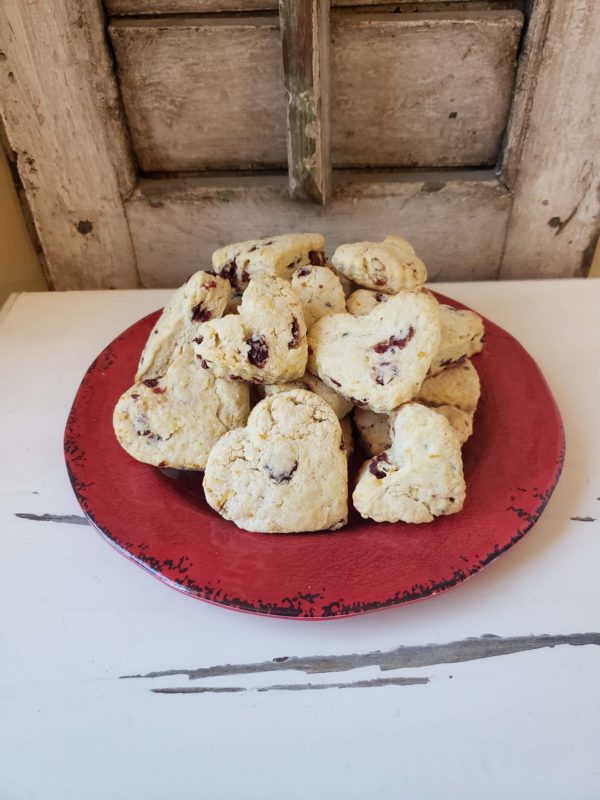
FAMILY TIME yep when the whole fam gets together it’s fun time! That includes all ages so increase your games, entertaining accessories and all the fun fam favorites. Think about what you do when the family gets together? Include a display with popcorn bowls or slice and bake cookies and sprinkles, extra games, rethink the bar, get the latest smore bar and don’t forget the seasonal outdoor games. A football or croquet or even some fishing poles will go a long way. When families get together, they play games, drink, eat, and try to make memories. TIP: Leave a few journals or family photo frames with your info for them to take home!
Read the original article on Business Insider UK Copyright 2016
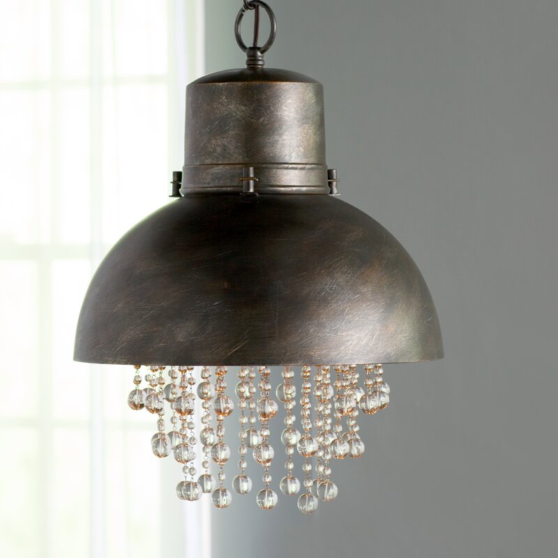
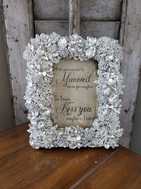
ROMANCE a getaway for 2 usually has romance written all over it. Add some faux fur pillows and throws or games for couples. Leave a bottle of champagne or some choc covered strawberries in the frig. Mention your dimmer switches and set the music to a local romantic music choice. Maybe set out some bubble bath in the bath along with some real/faux candles. TIP: Personalize it and make it feel like everything is set up for just the 2 of them.
OCCASIONS celebrating weddings, anniversaries, and birthdays is always my favorite. This is just like family time but with lots of personalized and themed things throughout. Anything from personalized congratulations vignettes, to a custom list of things they might need such as a local bakery, catering or florist. You might include streamers, candles, themed napkins and plates or even an emergency bridal kit with all the emergency tools a bride might need.
When you go out of your way and add a few custom touches and personalize it everyone takes notice and with social media they will tell the world how great your vacation rental was!
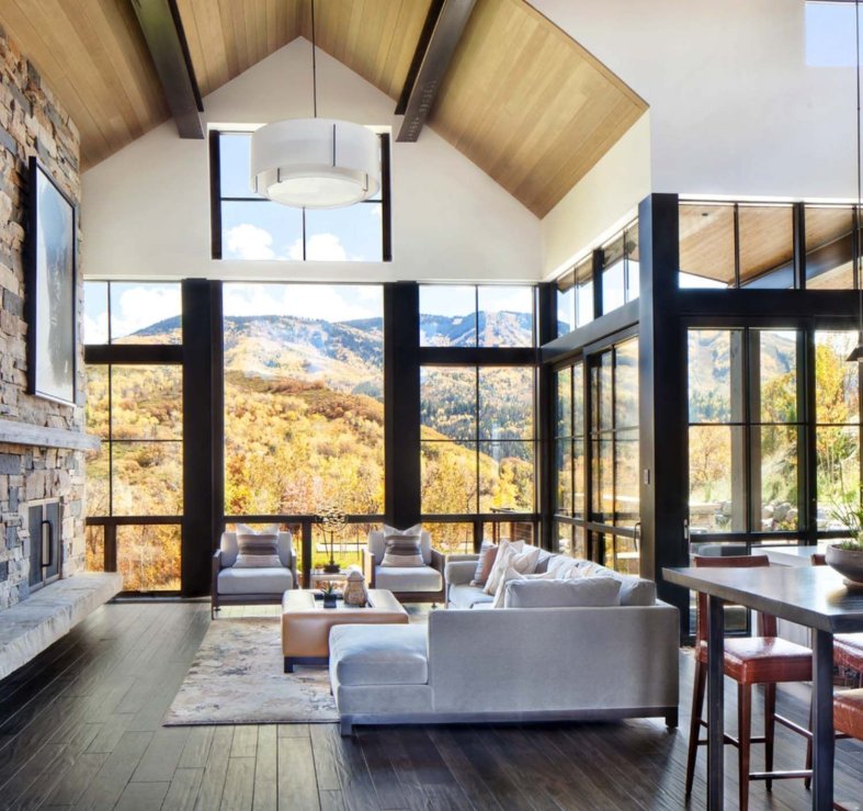
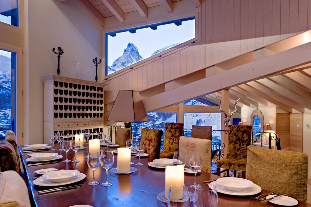
The living room in Chalet Grace in Zermatt, Switzerland boasts exquisite views of the Matterhorn.Airbnb
Read the original article on Business Insider UK Copyright 2016
CArrie
XOXO