Welcome all my Striped Barn friends! Are you wondering what the color trends are for 2021? Or are you someone who chooses your décor and colors based on what you like? I’m the latter. But…I always stay up on the trends! So whether you are team neutral or team color…there are different ways to let your colors shine through!
I don’t care if peacock blue is in…you won’t find it in my home because I’m a neutral girl. It doesn’t mean I don’t like color or wouldn’t love it in your home…its just that we all have our own taste when it comes to home decor. For instance, this year Pantone chose GRAY AND YELLOW for their 2021 COLORS OF THE YEAR and I’m so happy that they finally picked a neutral and even one of my favs!! Yellow is not something I personally would use a lot of, but I think its a great color for Easter and spring decorating, summer accents or happy pops of color! The great news is they picked 2 this year so its a win win whether you are team neutral or team color!
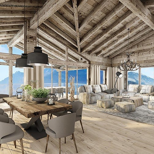
NEUTRALS ARE A GREAT WAY TO SHOW YOUR STYLE and you can get your “color fix” with them because they really are more interesting than you think, and they don’t fight each other, THEY WORK AS A TEAM. Plus, think of the fun you get to have all year decorating with unlimited “holiday and seasonal color”! You can see how something as simple as the green plant in the photo below “pops” in a neutral setting.
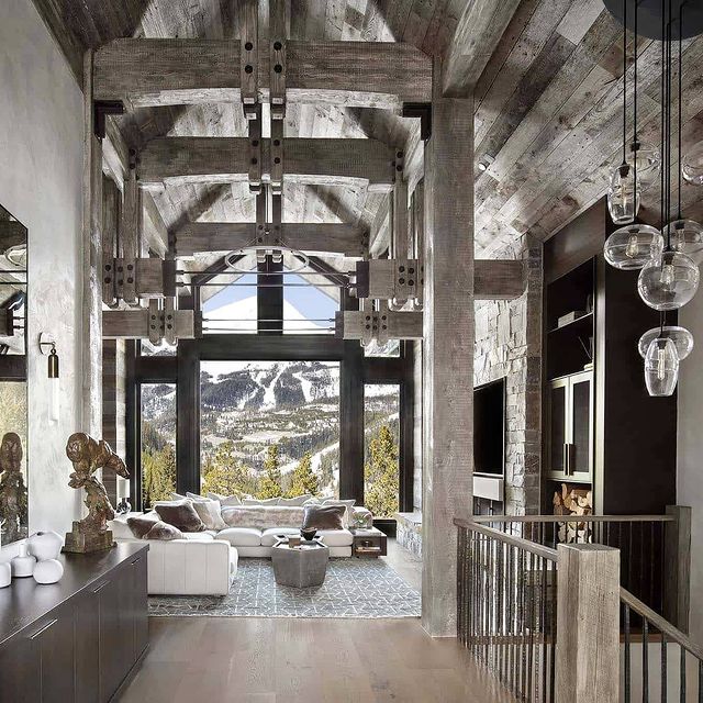
DECORATING WITH NEUTRALS IS GREAT BECAUSE you can GET EASILY BORED WITH ONE COLOR SCHEME. Seriously… 2 years was always my max before I would get rid of everything and change to a new color and style because I would get bored! I know some of you are shaking your head right now thinking yes, that’s me too! But… a great way to add color is with natural elements like TEXTURES! In the photo below the natural color of the fireplace stone natural has color and the view is living color at its finest! That is my kind of color…
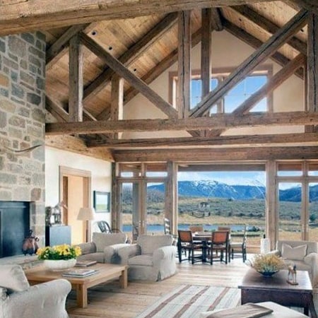
ALL OF MY POSTS ARE NEUTRAL because I love how neutral feels and how it feels like nature, the outdoors and natural elements. It allows us to see and feel the space in a good way without all the busyness and it SETS A GREAT BACKGROUND FOR IMPORTANT THINGS LIKE OUR TREASURES OR A GREAT VIEW! Pops of color are much more effective than too much color! If you think you need lots of trendy color to freshen up your space, TRY DOING THE OPPOSITE AND PULL IN THE NEUTRALS…you will be amazed at the interest you can create with “SUBTLE COLOR”. I bet you will love it!
Happy Decorating!
Carrie
XOXO


